Role
Product Designer
Timeline
1.5 months
Team
Product + Engineering + Stakeholders
My Part
End-to-end workflow design from discovery to prod

PROTECTED · NDA
Enter password to view case study
The detailed process is protected, but here is the public version. Have the passcode? Step in for the full case study.
no passcode? Get in touch ✦
← BACK TO WORKThe Problem - A simple question, a messy process
TLDR; Before work starts, each team member needs to confirm their independence. I designed a workflow that made it easy to request, track, review, all in one place.


The stakes

3 major frustrations and pain points to solve

Too much time spent chasing responses
Seniors had to keep following up instead of moving the engagement forward.
No single view of team status
Responses were spread across email, calls, messages, and spreadsheets.
Every response had to be recorded
The team needed a clear record of who responded, when, and whether any conflicts were raised.

Framing the problem
At first, the obvious solution was a central place to send requests and collect declarations. But that only solved the start and end of the process — not all the chasing in between.

I worked through the workflow with our audit stakeholders, then pressure-tested the problem and early ideas with beta testers.
The more we unpacked it, the clearer it became: collecting responses wasn’t the hard part. Coordinating everyone around them was.
Workflow mapping
The declaration took minutes. The coordination around it could take days.

01
02
03
04
Send the ask
One senior, a whole team, and a lot of messages.tion
Wait for replies
Some answer fast. Some disappear into the void.
Chase the gaps
Check who’s missing. Follow up. Repeat.
Handle conflicts
Conflict? Replace the member and start the loop again.
I mapped how independence was actually handled before AiBi. What looked like one simple task was really a repeating coordination loop.
Artifact review





What the current process was telling me
The bet
ROUGH AI PROTOTYPE
Testing the workflow before polishing the UI
Before committing to screens, I built a rough prototype to test the basic flow: request a declaration → respond → track the team → handle a conflict.

The goal wasn’t visual fidelity. I wanted to see if the workflow made sense end to end.
My first approach was the obvious one: put every team member and their response in one place.
It removed the need to piece together status across emails and messages, but it still treated tracking as a list to manage.

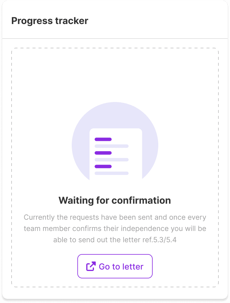
The progress card showed the big picture, but felt disconnected from the people causing it.
Good start, but still a list you would have had to read.
What it solved :
✓ Better than email
✓ Requests and responses together
✓ Made sending requests easier
What it didn't solve :
✕ Still too passive
✕ Progress required scanning the table
✕ Blockers weren’t obvious
✕ The next action wasn’t clear
Feedback/learning
Centralizing the data wasn’t enough.
The lead needed to understand progress and blockers without reading every row.
Design rationale
Status, activity, and the next step stay in the same view so the product helps move the process forward, not just report on it.
V1 put everything in one place, but the lead still had to read through the table to understand what was happening. For V2, I focused on making progress, recent activity, and the next step visible at a glance.
I brought the next step onto the page — but showing the entire letter this early was overkill.
Progress alone told me where we stood. Activity helped explain how we got there.

What it solved :
✓ The bigger picture became visible.
Progress, recent activity, and the next step gave the lead a quicker read on the engagement.
What it didn't solve :
✕ Everything still competed for attention.
Pending responses and conflicts weren’t much more prominent than information that didn’t require action.
✕ The letter preview took up too much space too early.
Feedback/learning
More information wasn’t the answer. Better prioritization was.
The final version needed to surface what required action first.
Design rationale
MV1 answered “who responded?” V2 tried to answer “where does the whole progress stand?” by adding progress, recent activity, and a visible next step.
Directions we didn’t take


Hover over any one to see reasons
Start the process
Send independence requests to the whole team from one place, instead of kicking things off through scattered emails and messages.
Track every response
See who has replied, who is still pending, and who needs attention — all in one clear view.
Follow-ups/reminders
Set reminder rules so the system can do the nudging, instead of the senior having to remember who to chase.
Confirm and submit
Add your declaration right through the portal no need to contact/communicate within the team.
Move straight into the letter
Once the team is cleared, the workflow carries that progress forward into the audit committee letter instead of making the team start over.
Deep dive into few major parts
1. Don’t make the lead count rows.
The tracker answers the first question immediately: “Can we move forward yet?”
Progress, pending responses, and conflicts stay together so the lead can understand the state of the whole team in seconds.
UX reason: overview first, details on demand.
2. See it. Fix it. Keep moving.
3. The system can nudge. The auditor still decides.

LET'S TALK NUMBERS
Impact
~ 75 %
Fewer manual coordination steps
6 tools → 1 workflow
Fewer manual coordination steps
BUILT FOR SCALE. BUILT FROM SCRATCH
Design system