Role
Product Designer
Timeline
1.5 months
Team
Product + Engineering + Stakeholders
My Part
End-to-end workflow design from discovery to prod

PROTECTED · NDA
Enter password to view case study
The detailed process is protected, but here is the public version. Have the passcode? Step in for the full case study.
no passcode? Get in touch ✦
← BACK TO WORKContext
The product wasn’t the most interesting part. The data was.
While raising funding for Sorcea’s B2C skincare scanner, investor and customer conversations kept surfacing the same signal: people were increasingly interested in the data powering the product.
That revealed a bigger opportunity, the data itself could become a product.

This insight led us to explore Skyn, a platform designed to make Sorcea’s skincare data accessible and turn it into actionable insights.
Foundations for creating skyn
User Identification
Contextual inquiry revealed 3 user types: Brand managers, analysts, and product stakeholders
John Doe
Skincare market analyst
Core Pain Points
Hard to validate a trend
Decision paralysis
Too many steps to reach a decision
32%
Trust legacy tools
2-3
Hours manual analysis
Goals - View Data, analyze trends
Contextual inquiry revealed 3 user types: Brand managers, analysts, and product stakeholders
40%
Time lost switching
5–7
Tools used
Competitive research
Data sources
Benchmark
(Spate / Trendalytics / NIQ / Circana / Launchmetrics)
Fragmented data sources
Search trends, SKU data, social
reviews, and media influence data
Multiple tools workflows
Too aesthetic and non interactive
Highly complex and mostly for data analysts
Skyn
What we can do/ are already doing
Unified sorcea collected dataset
Multiple data types + Genuine reviews and ratings
Easy to use, single tool
Actionable data visualizations
Intuitive and easy to use by everyone
Type of Data
Workflow & Usability
Data viz
Tool complexity
The platforms were also largely built for data-heavy users, with complex navigation and visualizations that added surface-level polish without helping users interpret or compare insights.
This gave us a clear direction for the MVP: one platform, one unified data source, and a much simpler path from question to insight.
MVPs
Our first instinct was to simplify the workflow with a guided wizard

We translated the most common filters from early user conversations into a multi-step flow that felt clean, structured, and easy to follow.
At this point, the assumption was simple: if we reduced complexity, the experience would work.
Testing showed that simplicity had become a constraint
The MVP was easy to follow, but the wizard was too rigid for how analysts actually worked. A tree test and early customer feedback showed they needed to move faster between demographics, combine multiple filters, manipulate data, and access raw data when necessary.
For V2, we expanded the workflow around flexibility and control, without bringing back the complexity we were trying to remove.
Open Skyn
Open Skyn
Create Project
Choose Dataset
Explore Entire Dataset
Choose filters
Drill down on filters
Explore demographics
Explore products
Quick look different views
View filtered data
Add multiple filters
Analyze trends
Analyze trends
Insights
Insights
Apply Preset Filters
Initial Workflow expectation
Remaped workflow - from query wizard to decision workspace
V2 worked — but it still wasn’t ready to ship
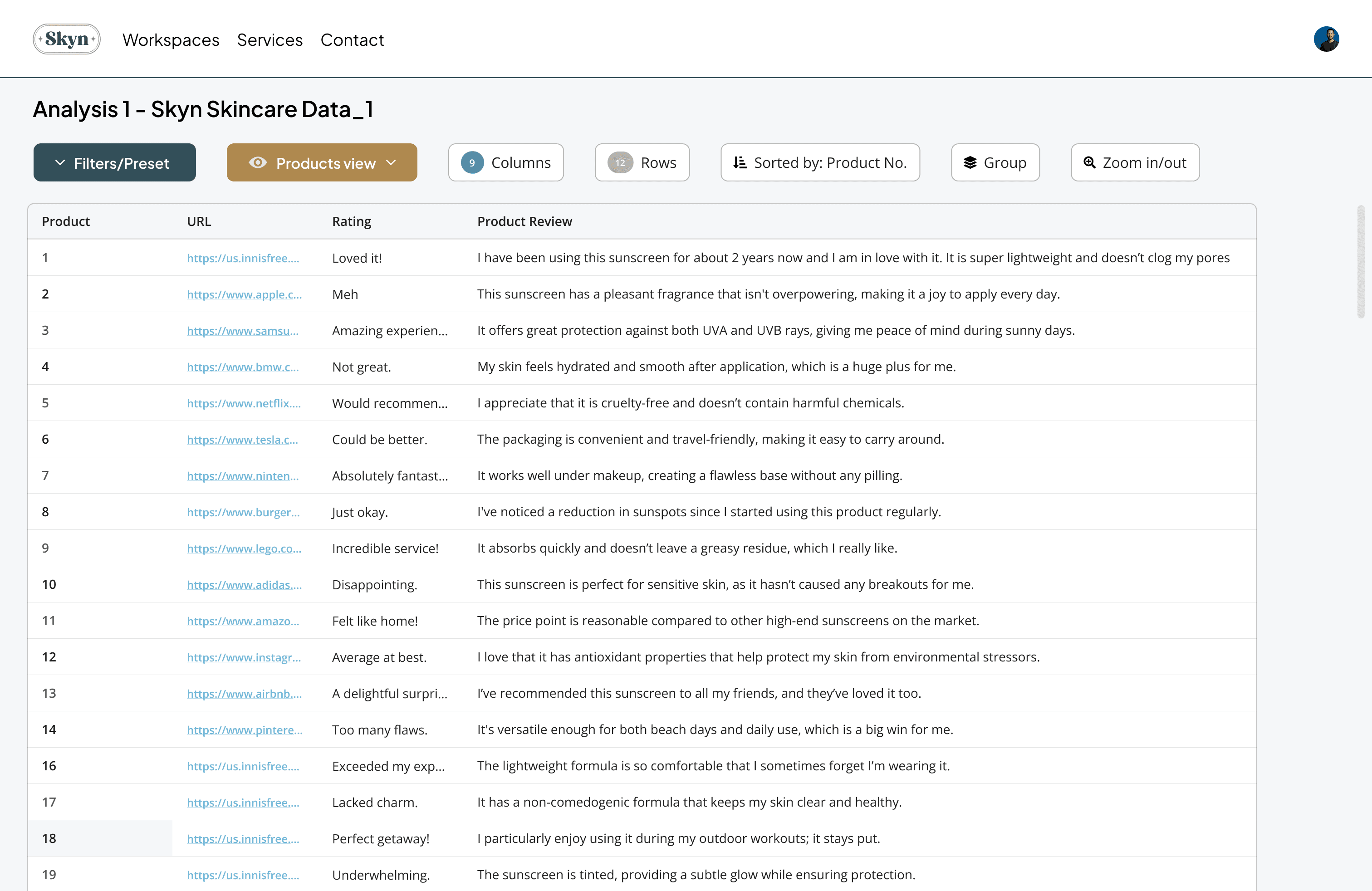


Users responded well to the added control, and stakeholders were comfortable moving toward launch. But deeper testing revealed a bigger issue: the product was solving for power users, not yet for a broader customer base.
That shifted the question from “Does this work?” to “Can this scale beyond expert users?”
Feedback and changes
Nearly two-thirds of newer users wanted major changes.
Around 80% expected product-level information, but our data was still organized around internal product numbers.
60% missed key filters because they were buried inside dropdowns.

Product data used internal IDs, which made product-level analysis difficult.
Filters were critical
but were hidden and missed by 60% of the testers
Dev team were confused on the
functional similarity of views and filters
The global Plus Jakarta sans for data entries was moved to roboto as a more mono spaced sans

Aa 1 2 3 4 5 6 7 8 9 10
Jakarta Sans
Jakarta Sans
Aa 1 2 3 4 5 6 7 8 9 10
Gender
Age Range
City
Skin Tone
Skin Type
Filters/Preset
More control didn’t mean better insights - Critical pivot
The second MVP attempt gave users more control, but testing revealed that control alone wasn’t enough. We needed to rethink the structure, not just add features.
We needed to move from a flexible table experience to a decision workspace built around datasets, visible filters, product-level clarity, and repeatable analysis flows.
Final solution
Deep dive into data
What I did before moving ahead
What data needs viz according to our target companies?
Taking a look into our own data
What sort of trends are they analyzing?
Gender
Age
CIty
Skin Tone
Skin Type
Skin Goals
Skin Goals
Product # URL
Product # Rating
Product # Experience
Products were categorized by number instead of names an imp change to move ahead
Data that leads to company/product level decisions; like purchase trends, geographical analysis, and cost comparisons.
What SKUs are selling?
Where are they selling?
What skin profiles are buying these products?
No longer a tool but a platform!
We introduced a new visual identity and rebuilt the landing, login, and onboarding experience to better explain the value of Sorcea’s data and what users could do with it.
Feedback and changes
Filters had become the most-used part of the MVP, so we made them a primary part of the interface with a persistent sidebar instead of hiding them in the flow.
With the data now better structured, we could also introduce KPIs, sorting, grouping, and faster ways to compare datasets
Moderated testing also revealed that users repeatedly applied the same filter combinations. We used that behavior to rethink views as predefined categories.

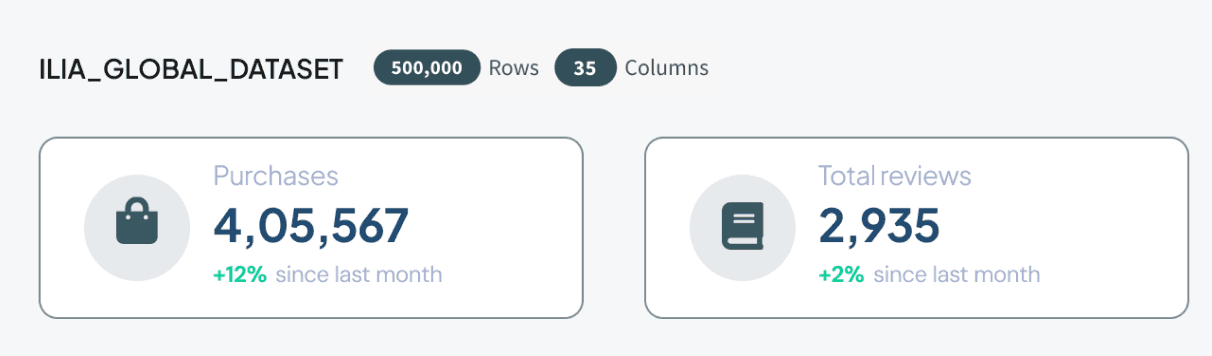

Dedicated dashboard +
sidebar
Global data sampled into categorized presets
based on user activity of first click filters
KPIs for quick stats
Filters was a feature
that got the best traction
so we put them front and
center of the dashboard
The cleaner data set allowed
us to add sorting and
groupings

Gender
Age Range
City
Skin Tone
Skin Type
Filters/Preset
(Next big thing at Skyn)

Design system